ROLE:
Brand Identity, Wireframing, Prototyping, Usability Testing
PROJECT TYPE:
Case Study
TIMELINE:
2 weeks, December 2023
TOOLS:
Figma, Zoom
INTRODUCTION
Helping kids explore & navigate the finance the world
The value of learning about personal finances early can set up your children for a successful future. According to Forbes, 50% of children surveyed wish their parents taught them more about money. With so much information about finances on the internet, it can be difficult to find what website is best and will benefit your children. Here is where Build Early Money Habits can make a difference for a child’s future.
Parents of children between the ages of 10-12 needed a resource to help educate their children about financial literacy, ensuring their future financial success. The only problem was that Build Early Money Habits lacked any brand identity or digital experience.
THE CHALLENGE:
Parents lacked a trusted resource to teach their children financial literacy, highlighting the need for a clear brand identity and intuitive digital experience to build credibility, communicate value, and support enrollment
THE SOLUTION:
Design a cross-device interface that builds trust with parents through informative content, engages children and also has a strong and distinct brand identity
RESEARCH
Finding that financial education sites were falling short & lacking an identity
When doing competitive research it was seen that most of the competitors’ had an easy to navigate website and was very user friendly, especially everfi.com and youth.handsonbanking.org, but the websites provided no strong brand identity. A few of the competitors offered courses for grades K-12 but were programs that were meant to be incorporated into a classroom setting, such as moneytimekids.com and fitmoney.org. On jumpstartclearinghouse.org, they provided resources to help teach kids with special needs which was something I saw no other competitor providing.
All competitors lacked an app. The websites focused on educating parents and teachers about courses for class integration with the exception of everfi.com.
.png)
EMPATHIZE
Figuring out what features were essential to prioritize
To empathize with the user, I used the MoSCoW method to help prioritize what features to include and emphasize on the interface. This method was necessary due to the time constraint and helped me identify the most important aspects of the design journey. It allowed me to prioritize features that were necessary vs. can be added later in time.


Creating a user persona
To better understand our user’s needs, goals, and pain points, a user persona was created based on the design brief. The user persona is as follows:
Tony, who lives in Houston, is a store manager at a local hardware store and is a father of three children, 8(F), 10(M), and 11(M). He always struggled with finances and recently his eldest child spoke to him about an allowance. They are a middle class family and figured this would be the perfect time to educate them on personal finances. Only issue was that he didn’t know where to start. He works on the weekends and isn’t able to drive them to an in-person program held at their library.

BUILD EARLY
MONEY HABITS
Designed the interface for desktop and mobile to create a distinct visual identity for the client
IDEATION
Designing the journey for the user
The next step before designing the interface was to establish a user flow chart. This diagram is used to visualize how users will navigate the website/mobile interface to accomplish their goals of learning about the online course and signing up their child(s) for the program.
.png)
LOW-FIDELITY WIREFRAMES
Sketching out the website's key pages before the build
I started the design process by sketching low-fidelity wireframes, aiming to visualize the functions based on the user flow chart I created.
These were the rough sketches for pages I wanted to include and prioritize on the website - homepage, our mission, a page for parents to learn more, the signing up process, the student portal login, and also the dashboard for the students.


Homepage
Student Dashboard


Our Mission Page
For Parents Page


Student Portal Login
Getting Started Page
MID-FIDELITY WIREFRAMES
Building out my sketches to see what works best
After the sketches, I created mid-fidelity wireframes to establish additional content and UI elements, maintaining a strong focus on visual hierarchy and grid-based design. The wireframes I designed would be later used for usability testing.

USABILITY TESTING
Testing how parents navigated through the prototype
I tested 5 users' ability to complete the task in the prototype. In a mix of in-person and Zoom 1:1, I tested the prototype with parents of children between the ages of 10-12. I measured success by the number of user errors and the reported ease of navigation through the tasks. I also wanted to see how well the app addressed users' pain points, motivations, and goals.
For the usability testing, they had to complete the task of:
Read through the home page and then find their way to the ‘Our Mission’, or ‘For Parents’ page. From here, proceed to go sign up for the online course and login to the Student Portal.
5
Participants
100%
Success Rate
Useful constructive criticism
Overall, participants navigated through the user task with ease – there was no confusion or any hesitation across all five tests. The layout of the website was very user-friendly and finding their way around required not much effort. However, they had comments about the content being provided.
Almost all users had the suggestion to add something to showcase how far along they were in the sign up process and to possibly write a sentence or two with each step. The area felt empty and thought it would provide clear instructions/directions.
This was a quick and easy addition that I could easily incorporate into the high-fidelity frames.
“The home page definitely grabbed my attention but include more info during the signing up process”
-A.D.,User #3
UI STYLE GUIDE
Creating a thoughtful identity that builds credibility and connection
Typography
For the fonts being used throughout the website/mobile interface, I chose Oswald and Lato.
I chose Oswald because it’s a bold typeface that offers a strong, structured appearance, making it ideal for the client. It provides a powerful visual impact as a heading and is also widely accessible and pairs well with clean, simple designs.
I decided to go with Lato for the body font due to its readability across various screen sizes. It provides a very clean look and the slightly rounded letterforms provides a friendly feel.


Brand Colors
Many financial websites/apps can feel intimidating or dull, so I wanted to create a brand that felt welcoming and inspiring. I chose a calming blue paired with a thoughtful purple to create a sense of trust, clarity, and imagination.
Blue grounds the experience in reliability and professionalism, while purple adds a creative, approachable tone that makes learning feel less intimidating. Together, they create a balanced, engaging look that supports both education and confidence.

Tone & Styling
Build Early Money Habits will be using sentence case.
Title case felt too formal and disrupt the flow of reading. With sentence case, it is easier to maintain consistency. By eliminating capital letters, it can make it easier for users to skim over longer form texts. As a brand, we want parents to be able to find us as trust worthy and that they are communicating with people who care about their children’s personal finance education. With sentence case, it feels as if you are having real human conversations.
Educational
We emphasize the focus on learning, knowledge, and imparting valuable financial skills to the children
Empowering
We want to inspire confidence, self-assurance, and allow a sense of control over one’s financial future
Interactive
We want to promote engagement where the kids are actively shaping their financial knowledge with fun lessons
Trusting
We want to build trust through transparency and the brand's commitment to high-quality education
Friendly
We want to create a warm and approachable atmosphere to make parents and children feel comfortable and welcome
Icon Guidelines
Size: Minimum size for an icon is 20 x 20 and max size of 28 x 28 as needed
Stroke: All icons should have the weight of 2.5px
Colors: Default color is #000000 but can be used in any brand color when necessary

Microinteractions


Imagery Guidelines
-
Images used should show a sense of collaboration, learning, or studying
-
Include high-resolution images that convey a clear message to users
-
Use images of children happy and excited to learn
-
Have a diversity of students
-
Images should be bright and full of color
-
Do NOT use black and white photos
-
Do NOT use blurry photos

Grid & Spacing
I went about using the responsive web design approach that allows for web pages to render well across various devices and screen sizes.
This results in our visitors having a smooth experience navigating the site, regardless of the type or the size of the device.
.png)
.png)
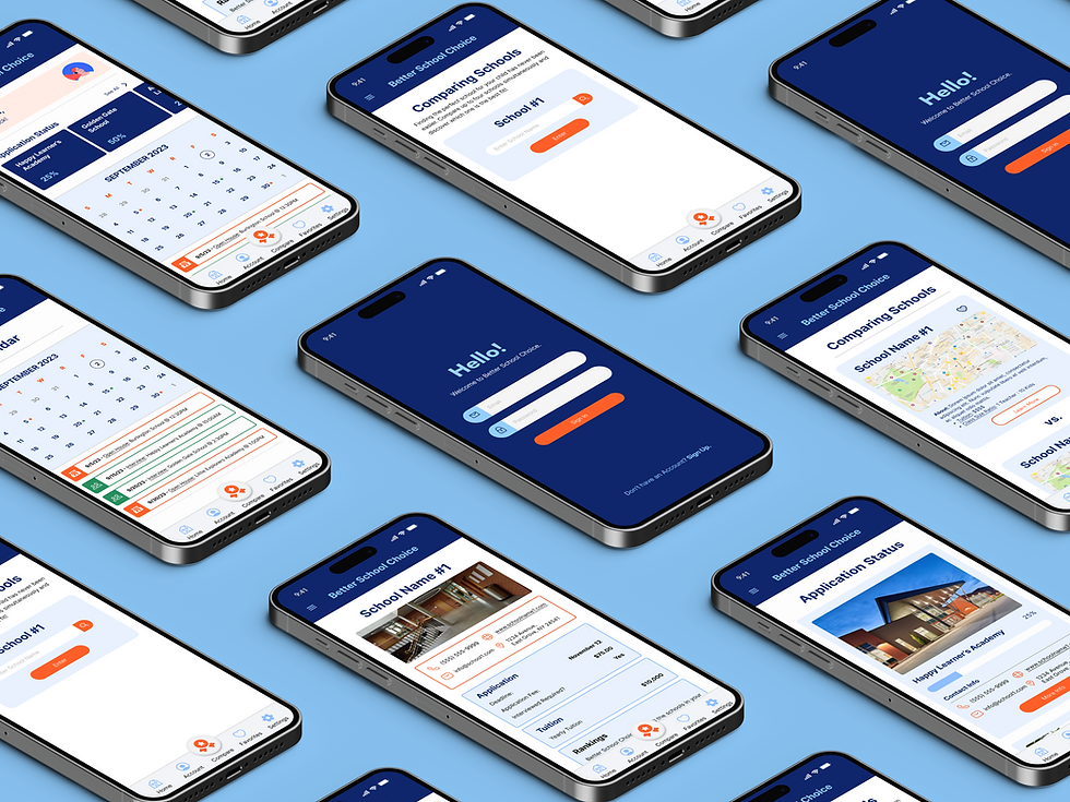
FINAL DESIGN
Implementing all the revisions & style guide to create Build Early Money Habits
Taking all of the users feedback and incorporating the brands colors into the design, I was able to create the final prototype.

Providing a meter for the Sign Up process
I included this to give users a clear sense of where they are in the sign-up process, along with clear instructions for each step

Bringing the brand to life with imagery & colors
To enhance brand identity and form a connection with the users, I implemented the brand's style guide throughout the website. This helped contribute to a more visually engaging and cohesive user experience


REFLECTION
A designer's job is never done & there is always room for improvement
For this case study, I really loved having complete creative freedom for the UI design of the website and mobile design. I enjoyed picking out every small thing from the color palette, to the font, to even the images I wanted to be used throughout the site. I achieved my goal of wanting it to be a sleek and user-friendly interface so parents/guardians can navigate through the site easily.
For the future, I would love to play around more with layouts and the hierarchy of a website. I want to be able to have more fun and memorable interactions throughout a website and mobile design.
Something I would have changed throughout this process after some reflection, would be to adopt the mobile-first design approach. More and more people are accessing websites through mobile devices making it important to prioritize the mobile experience. Since there is limited space, it forces us designers to prioritize essential content and create a more focused layout.
.png)
.png)