WOMEN'S FORUM ON AFGHANISTAN
Freelance work for a non-profit company that strives to advocate for women in Afghanistan
View Website
WEBSITE IS LIVE!
.png)
ROLE:
Brand Identity, Wireframing, Prototyping, Usability Testing
PROJECT TYPE:
Freelance Work
TIMELINE:
2 weeks, June 2025
TOOLS:
Figma, Wix
INTRODUCTION
Bringing an existing design back to life
The client approached me with a need to redesign their website, which had not been updated in a quite some time. The existing website was not cohesive and outdated in both design and functionality, making it difficult to navigate. It was very difficult to read and understand the information being given to us. It was not a very pleasant user experience and would more than likely make a user not want to continue going through the website. It felt all over the place and they needed assistance to revamp the site with a 2 week turnaround.
They had a meeting coming up and wanted to have a more polished site to showcase who they are and what they do for the women in Afghanistan and have it be clear to the users.
THE CHALLENGE:
Client needed a new website due to the usability issues and visual hierarchy in the existing website
THE SOLUTION:
Redesign the existing site architecture to improve usability and allow for an overall better user experience
PREVIOUS DESIGN
Taking the time to look at the old website and finding the issues
Before starting the redesign, I spent some time reviewing the existing website to understand what wasn't working and what needed improvement. I took note of the layout, content structure, visual design and the overall user experience.
From there I was able to identity the areas that felt outdated, consistent, or difficult to navigate. I gathered that:
-
Pages were cluttered and not easy to read
-
Some CTA's were not necessary
-
Lack of visual hierarchy
-
Outdated design elements
-
Navigation could be simplified


Pain Points
01.
Design lacked layout and format cohesion
02.
Design lacked typographic hierarchy and cohesion
03.
Did not meet accessibility standards
04.
Navigation needed to be revised
FINAL DESIGN
Introducing the new and improved Women's Forum on Afghanistan
With a clear understanding of the old website's pain points, I was able to develop and design a new and improved site that resolved those issues and enhanced the overall user experience.

Designing a site with format & typographic hierarchy cohesion
Having a cohesive format and typographic hierarchy is important in delivering a seamless and user-friendly experience. I implemented a new header and font to improve visual consistency and reduce cognitive load by highlighting key messages and helps to create a natural reading flow.
When visual elements and text styles are consistent, the users are more likely to stay engaged and it builds trust by presenting a more polished and professional brand presence.
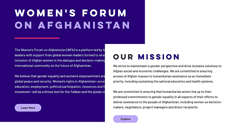

Fixing navigation and allowing for accessibility
By fixing the navigation and simplifying it from what they had before, it helps guide users through the website with clarity and ease, enhancing overall usability. I also added in a search bar so users can easily find whatever it is that they are searching for.
Accessibility plays an equally important role by ensuring the site accommodates a wide range of users. Prioritizing both ensures a seamless and inclusive user experience.


REFLECTION
Wishing for more time but enjoying the challenge
Due to this project needing a quick turn-around, I would have loved to have more time to do the proper research and allow for user testing. In the time frame given to me, I was able to successfully redesign the typographic hierarchy of the website and give it a more cohesive look while giving it a fresh and modern feel.
I enjoyed challenging myself with the short timeline given and being able to provide a design solution that aligned with my client's goals and expectations. They were very pleased with the results and were very grateful for my cooperation and giving their website the refresher it needed.
Click here to view the live website!
.png)